

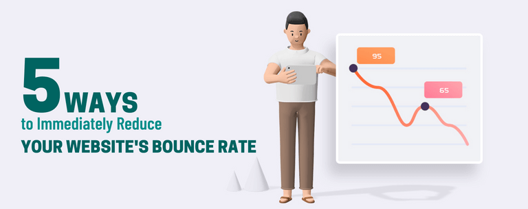
5 Ways to Immediately Reduce Your Website’s Bounce Rate
Bounce rate is the percentage of visitors who leave your website after viewing only one page.
Bounce rate is a metric that’s important to any business, but especially so for e-commerce sites. If you have a high bounce rate, it means that people are leaving your site because they’re either not interested in what you have to offer or because they don’t think you’re a good fit for their needs.
You can reduce your bounce rate by making sure your website is easy to navigate and offers clear information about what each page does. You can also make sure that you provide enough content on each page so that people aren’t lost when they click away from your site after seeing only one page. A high bounce rate can be a sign that your site isn’t meeting people’s needs. This could mean you need to update your content or make sure it’s more engaging. If you’re having trouble with this, consider hiring a professional writer or blogger who can help improve the quality of your content and draw in more readers.
- Improve Site Speed:
- Optimize Images:
- Create Relevant and Engaging Content:
- Improve User Experience:
- Use Effective Call-to-Actions:
Improve Site Speed:
It’s important to keep your site speed fast.
The average user will leave your site if it takes longer than three seconds to load. And that’s a big deal because the faster you can load your site, the more likely you are to make a sale.
That means no matter what kind of site you have—whether it’s a blog or a storefront—you need to make sure that every page loads quickly and effortlessly on all devices.
This is especially important for eCommerce sites because people tend to shop online when they’re on the go (or just not at their desks). So if things take too long to load, they’re less likely to buy something from your store! Here are some ways you can make your site load faster:
- Reduce the number of images on each page
- Set a caching plugin, like WP Super Cache or W3 Total Cache.
- Minimize the amount of javascript and CSS applied to each page.
- Use a CDN (content delivery network) to serve your images from a server that’s close to your visitors.
- Reduce the number of plugins and scripts on each page. -Keep your server updated with the latest WordPress version, which includes security patches and performance enhancements.
- Deactivate unused plugins, themes and widgets.
Optimize Images:
Images are often the first thing people see when they visit your website and it’s important that they convey the right message. There are a few simple tweaks you can make to your images that will help them load more quickly.
- Choose an image format that is less compressed and uses less bandwidth, such as PNG instead of JPEG or GIF.
- Add a large title and caption so visitors know what the photo is about before they click on it. For example, a Photo of an Orange instead of just an Orange. This helps people decide if they want to read any further before opening up a new tab in their browser window. A good way to find out how well your site loads is by using Google’s PageSpeed Insights tool. Here, you can find out how many seconds it takes for your website to fully load. If this number is over two seconds, then there are some changes you need to make! You should also try hosting your website through a service like Wix (or WordPress if you’re already using one), which offers better speed performance than other site hosting services.
- Finally, remember to optimize your videos and audio! Many people use YouTube as a replacement for streaming video because it’s fast and easy to use. And while YouTube does allow you to create playlists with multiple videos, we recommend only linking those playlists from your website. That way, you won’t have much of a bounce rate at all! The bottom line is that you need to make sure that your website is fast. Google has made it clear that they’re focusing on speed as one of their ranking factors, so if you want your site to perform well in the search engine rankings, then this should be a priority for you!
Create Relevant and Engaging Content:
One of the most commonly cited reasons for bounce rates is that the visitor came to your site looking for something specific and didn’t find it. You can reduce this by optimizing your content around keywords, which can lead people with similar queries to you.
Keep in mind that long-form content will be more engaging than short-form content, so it may work better as a way of grabbing visitors’ attention. And if you’re looking to increase your bounce rate, then your first step is to create great content. But this isn’t as simple as it sounds. You need to understand what people want from your website and how they want to be engaged with it. You might be surprised to learn that people are looking for the same thing they’ve always looked for: information. They want to know more about a topic, and they want it now. This is why shorter posts can work well in some cases—because they’re easier to digest and take less time to read through than their longer counterparts.
It’s also important to have high-quality images on your site; if you don’t have any, these are worth investing in. In addition, try adding video content or infographics to your design; these tend to be more eye-catching than plain old text. Your website should also be easy to navigate – as one of the first impressions about your company, potential customers want to feel like they know what they’re doing. Make sure that you’re offering clear links between pages (i.e., Read More) and plenty of navigational options when scrolling through content. In addition to making your website easy to use, you should also be sure that it’s responsive. Many people access the internet through their phones or other mobile devices; if your site isn’t optimized for these devices, they may not be able to view it properly.
When designing your website, you’ll want to keep in mind what kind of impression you want to give off. Are you trying to come across as professional, friendly and approachable? Or do you want to appear more serious and authoritative? Whatever kind of image you’re aiming for, make sure it shows through your design choices. For example: If you want to come across as friendly and approachable, don’t use a lot of text on your site. If you’re trying to give off an authoritative vibe, make sure that all of your content is easy to read and understand.
Improve User Experience:
- Make sure your website loads quickly. Studies have shown that a page takes 3 seconds or less before 50% of visitors bounce away.
- Provide a clear call-to-action in the top right corner of the screen so that users know what you want them to do when they visit your website.
- Place important content above the fold, which means that it should be visible without scrolling down past the first screenful of information on your webpage – it is more likely that visitors will stay if they can see what they came for at first glance and are not forced to scroll down your page. Make it easy for users to find the next logical step after completing a particular task by providing them with an intuitive way to continue their journey through your site – such as buttons labelled Next or Keep Shopping.
- Test different colours and fonts to find what works best for your audience. For example, using larger text instead of smaller text may keep people on the site longer because they won’t need to squint their eyes and strain their necks while reading small print. Likewise, bolding certain words or phrases in your paragraphs makes it easier for readers to focus on specific parts of the post. When in doubt, A/B testing (i.e., running two versions of a web page simultaneously and measuring which one generates better results) can help identify what design changes increase user engagement over time!
As with any design decision, it’s important to keep the user experience in mind. If you’re writing a blog post and want to include an image, don’t just use any old picture. Make sure the image is relevant (i.e., related to your topic) and visually appealing (i.e., not too busy or cluttered). You can also try adding a video instead of an image if you have one on hand; some studies show that videos outperform images in terms of engagement!
Ultimately, the decision to use an image or video is one that can only be made after analyzing the data. Try out a few different options and see what works best for your audience!
Use Effective Call-to-Actions:
- Make your CTA copy clear and concise: An effective call-to-action will tell the reader exactly what they need to do in order to convert, rather than leaving them guessing or searching for a way to proceed. A call to action should be so straightforward that even someone with no prior knowledge of your business can understand it. For example, if you are selling a book, don’t say sign up for our mailing list as this is not an actionable item. Instead, say click here for more information about our latest book.
- Emphasize urgency: You can do this by showing how quickly the offer is going away or by asking readers if they want it at the current price before it goes up.
- Set expectations early: One method of doing this is by explaining what will happen after they take the desired action. If someone signs up for your newsletter, tell them when their first email from you will arrive or where to expect their first email from you in their inbox.
- Limit clutter on every page: Reducing clutter also helps reduce bounce rates because it makes website navigation easier, which means visitors spend less time scanning through pages looking for specific content without finding it.
- Use a single goal conversion point on each page of your website: meaning that every page has one thing that the visitor must do in order to reach the next page (usually filling out a form).
- Make sure the site is easy to read and scan: Use plenty of white space, and limit the length of paragraphs. Long blocks of text are intimidating, especially for people who may have a short attention span due to multitasking (which is most people).
- Focus on one main message with each page: And make sure that message is clearly visible above the fold (the part of a web page visible without scrolling).
- Use a large font size for your navigation buttons: This makes them more noticeable and easier to click on without being distracted by other elements on the page.